The promoted ad I found on Twitter was created and shared by Sprint. By clicking on the link, users will be taken to a page describing the offer.
What are the ad’s strengths?
One of the ad’s strengths is the placement of the phone in the ad. It’s right in the middle and it helps potential customers know that Sprint is offering something related to Hulu. They’re being transparent with what they’re offering in the tweet itself and below the ad itself it provides another offer if someone were to come to Sprint. I also like the use of dark colors as the background because it makes the Sprint and Hulu logos pop, as well as what’s being displayed on the smartphone.
What are the ad’s weaknesses?
The fine print is too hard to read. I know it typically is, but on the ad itself it’s rather blurry. I’m not sure if it was done on purpose or not, but I found that slightly annoying.
What is the ad trying to accomplish with its design?
The ad is wanting potential customers to know that they can steam any show on Hulu in HD using their network with unlimited data. I think the ad does a good job with its design.
How has designed been used?
 Size: I think the element of size was used well in this design. A smartphone is something that people tend to have nowadays, so making that bigger than everything else in the ad helps people know it is phone related.
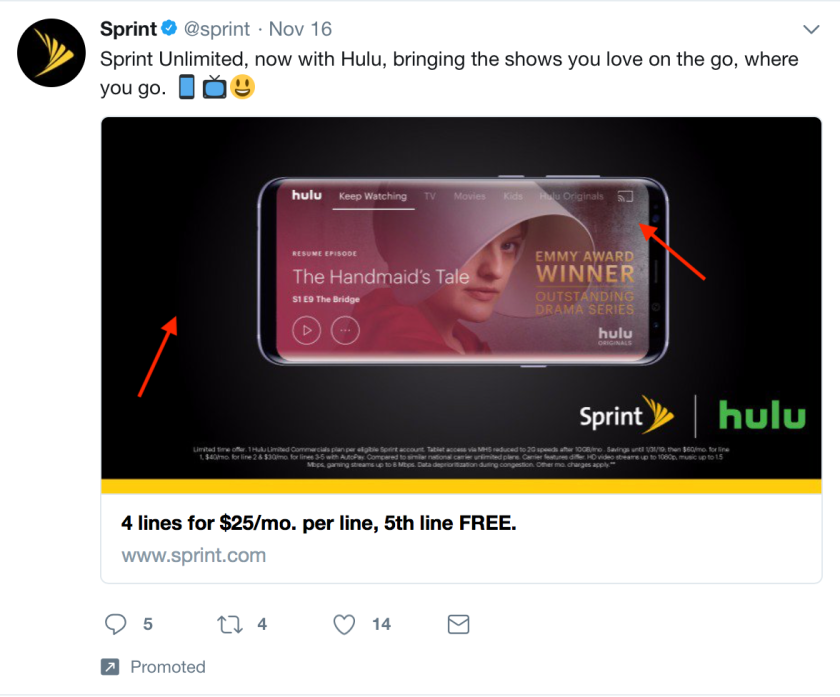 Contrast: I like the use of contrast in the ad. It’s easy on the eyes and makes everything visually appealing.
What metrics will be used to determine if the ad was successful or not?
Comments, retweets, and likes are metrics that will be used to determine if the ad was successful or not. Metrics that we don’t see but Sprint will be able to see include Profile clicks, Detail expands, and Link clicks. I think Link clicks are the most important because that means people are clicking on the ad and going to the offer page on their site.
The ad itself seems to be have been shared on November 16. As of today, there are 5 comments, 4 retweets, and 14 likes.


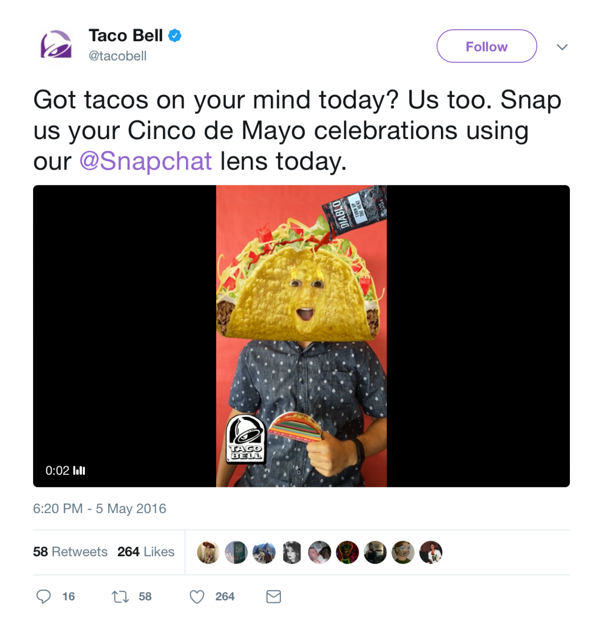
 On May 5, 2016, Taco Bell had some fun by giving Snapchat users the chance of a lifetime: changing their heads into giant taco shells. The campaign only lasted one day, but managed to acquire 224 million views. Snapchat stated that the number of unique plays equated to 12.5 years of individual plays on that single day. The lens also included the Taco Bell “bong” sound.