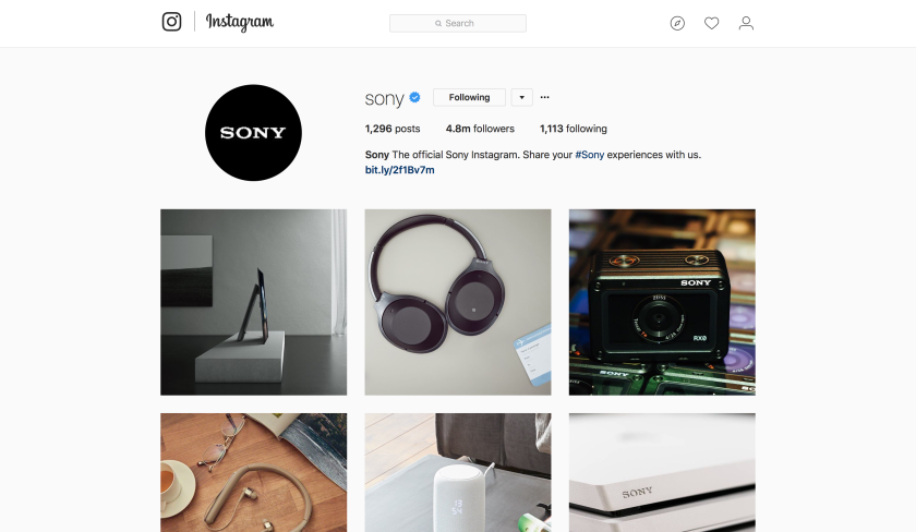
I chose Sony because they create a lot of things. Sony makes televisions, music players, cameras, headphones, movies, video game consoles and software, smartphones, and much more. I was curious to see how the Sony social media team handled all the products Sony produces as a whole and how they may compare to a more specific Sony brand, such as the PlayStation or Sony Pictures.
What are the brand design strengths?
Sony’s logo is very simple. I looked at their Facebook page, their Twitter page, their Instagram page, and their YouTube channel and noticed that they all use the same black background with white text logo. I like the simplicity of the logo and I think they can get away with it because everyone knows what Sony is.
From what I could tell, they use a lot of the same images all across Facebook, Twitter, and Instagram. I personally prefer looking through their Instagram profile since it is easier to find the images they’ve shared. I think they do a great job of displaying contrast between the background and the product they’re sharing in that particular image. They do a great job of having the product in a real-life scenario, such as having speakers inside a room or a television hanging on a wall or a DSLR or video camera outside. The images help you see where you should use their product. Obviously we want to use a television inside our homes, but it makes you wonder how that particular television will look in your living room hanging on the wall. I think they do a great job of capturing that.
What are the brand design weaknesses?
Because Sony sells so many things, their social channels can appear very cluttered. One minute they’re talking about a recent movie released by Sony Pictures, the next they’re showcasing their televisions, and then there’s something about the latest PlayStation. It’s a little all over the place, but they also have specific channels for that specific brand. I think that’s helpful because not everyone is going to be interested in everything Sony.
What is the brand trying to accomplish with its design?
I already mentioned this in the paragraph regarding the brand’s strengths, but I think what they’re trying to do with their design is get people to think how it would be to have a Sony product in their home, whether it be a camera or a television. The pictures they upload are beautifully taken and it helps Sony’s products have that “premium” look and feel.
How has the design used: Composition, Fundamentals, Contrast, Lines, Layout, Golden Section, Rule of Thirds, Not Half, Swiss Grid, or Custom Grids?
I believe they use the Rule of Thirds principle quite a bit in all their channels. The product they’re photographing is front and center. Sometimes it takes the entire size of the photograph. They also do a great job with contrast, as it helps their product stick out with the contrasting background.
What metrics (likes, shares, retweets, etc.) will be used to determine if the brand is successful?
Facebook: The metrics used to determine success is by the number of followers, the number of likes, the number of comments, and the number of shares.
Twitter: Followers, retweets, likes.
Instagram: Followers, likes, comments.
YouTube: Subscribers, likes, and comments.
Sony’s Facebook, Twitter, and Instagram channels have well over 4 million followers, with Facebook having the largest number of likes and followers. I think their most successful on Instagram just because they don’t share as much video content and the pictures look absolutely beautiful. Why wouldn’t you want to like what they share on Instagram?
